Implementing Color Analysis on my Image Blog
Uploaded on October 16, 2024
A previous iteration of this website had a feature that implemented automatic color analysis on all of the images that I uploaded to this blog. I can use this information to generate autobiographical information and gain insight into my icon.


This is what this image blog used to look like! It this had this sick ass feature that I haven't had for over a year at this point – it displayed dominant colors from the image, and you could click into the colors and see every image with a specific color.
This implementation had several issues:
- It used the default colorthief method of getting colors which used some sort of weird composite of colors. This made it get colors that were visibly wrong. For example, the dominant color, if you asked probably any person looking at this image, would be YELLOW. That is the object of the image, and this should be represented.
- There are 16,777,216 total RGB colors, and this method allowed any one of these colors to be assigned to an image. The idea here was to see if there would be some "crazy ghost in the shell" coincidence that I could stumble upon ie. for some reason one shade of red kept coming up.
- This is a bad idea because if this were the case it would probably just be a symptom of colorthief prioritizing certain colors.
I've wanted to re-implement this tool for a while, but do it better. This blog post will be me describing and implementing this feature. I am writing this blog post while I'm coding.
Specification
The feature will capture the five most dominant colors found in each image. These five images will be one of 64 possible colors. These values will be stored in my database and will be exposed to the frontend website on several pages :
-
/image-colors- This page will have a list of the 64 colors. You can click into each one of these pages and see the images with these colors. You can sort by default (all colors), and then by most frequent color over the last week, last month, last year.
/image-colors/{{color}}- This page will be a unique page for a given color ie.
/image-colors/blackwill contain all the images that have black. You'll be able to see frequency of image upload with this given color.
- This page will be a unique page for a given color ie.
/images/{{image_hash}}- This page will have the 5 most dominant colors. Each one of these colors will be one of the 64 colors above. Exploration of colors.
/mood(?) [/mood-and-color] (?)- This page will contain a graph of frequency of color upload mapped against my mood. What colors are making me want to capture pictures and upload them and how does this impact my mood? Does it? Only one way to find out – graph it.
Technical Implementation
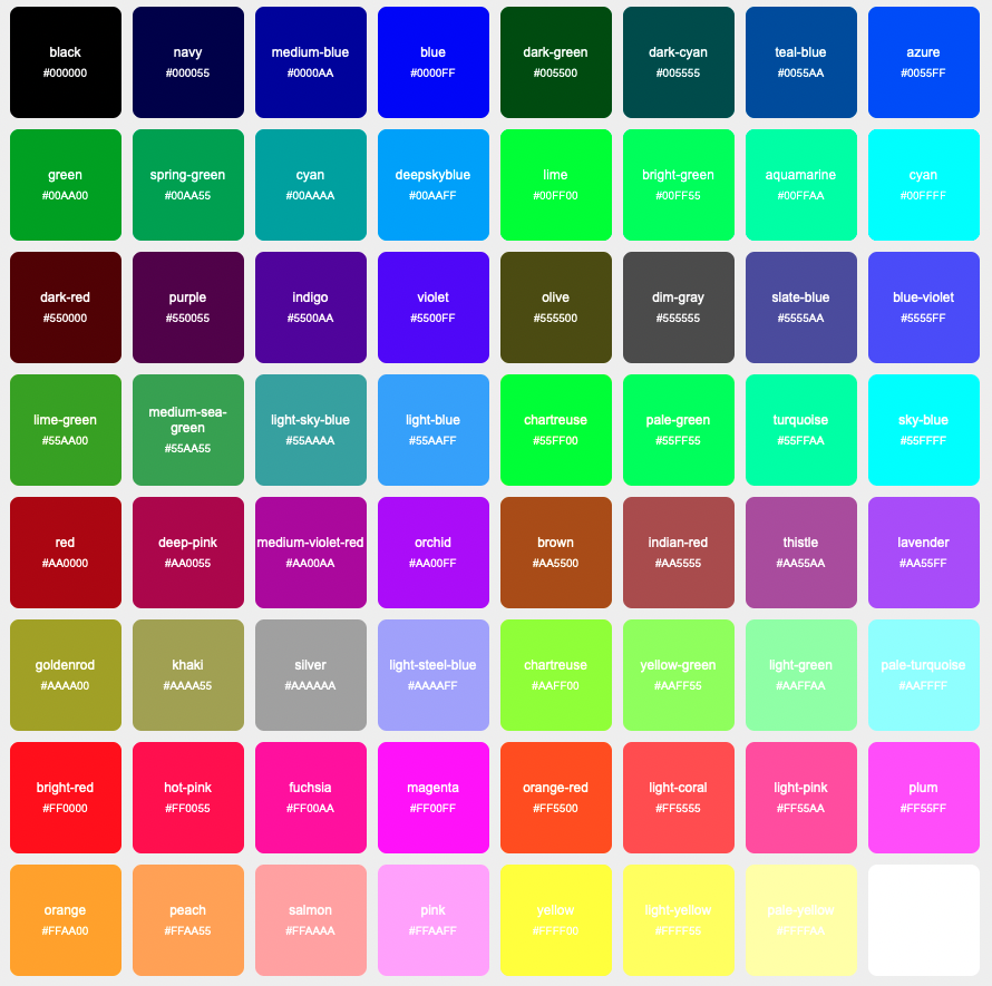
I started out by creating db table rgb_colors. This will just contain all of the possible colors. Since we want 64 possible colors, and we have three (r, g, b) different values for each single color, and 4^3 = 64, we can split each individual color value into 4 possible values – 0x00, 0x55, 0xaa, 0xff. We assign a name to this. Now we have ids in the database, which we'll need to act as foreign keys.
Next I create another table called image_colors which will contain an id, a foreign key image_id, FK color_id, and color_val. For ex if an image is exactly 1/5 red, the value for (color, color_val) might be (1, 0.2), where rgb_color.id = 1 when rgb_color.name = 'red'. color_val will be determined by the % of the area of the image that the given color takes up.
With this schema I'll be able to do:
SELECT i.* FROM images i JOIN image_colors ic ON i.id = ic.image_id JOIN rgb_colors rc ON ic.color_id = rc.id WHERE rc.name = 'red';
To get all the images that have red in it for example. I can also sort on color frequency for example. I would be interested to see all images that have any row where image_colors.value > 0.9 .
Now for the meat and motha fuckin potatoes: Getting the damn colors. I use a local Python script to upload images to my blog, so I'm going to use Python to do the image analysis. I need to write a script that's gonna do this for each image that currently exists on the filesystem + database, and then I'm going to modify my image upload function so that every new image adds its colors.
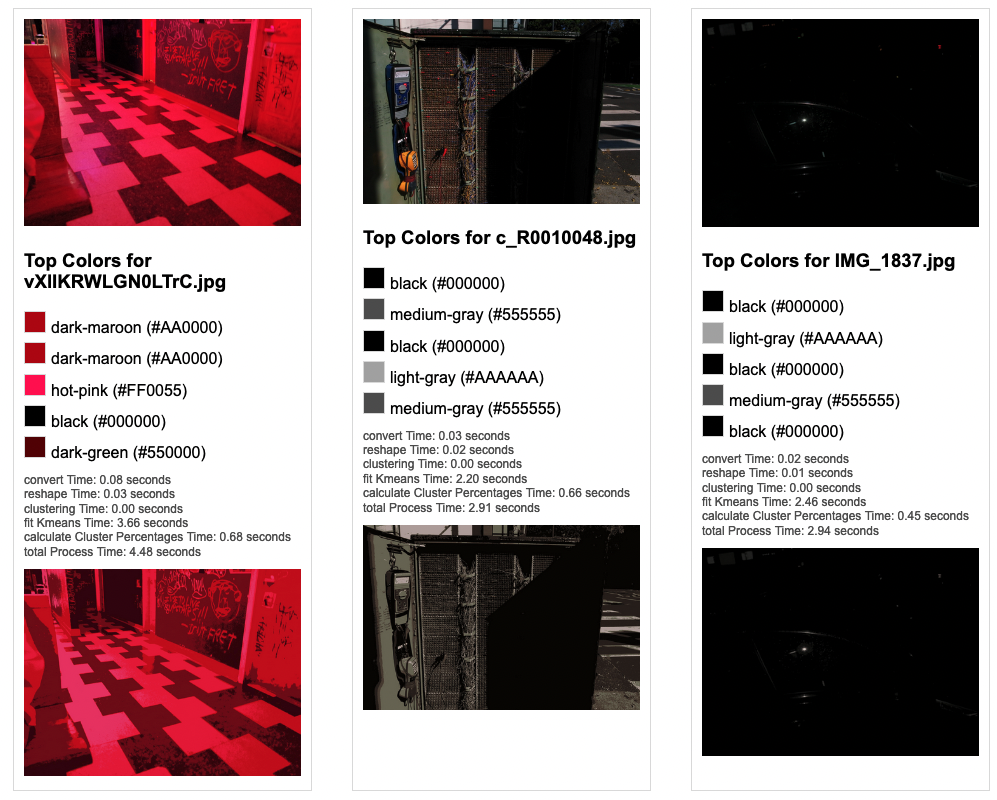
The first thing that I did was query the database, get all the possible colors, and then provide a directory with two images in it. I had the script open up the image, load the pixels into a List as rgb Lists. For each pixel I found the closest rgb value that was present in the db.
This is the dumbest way to do this , but the good thing about doing it this way is that you get every pixel value (although this actually might not be desired.) For example, in the image used previously:
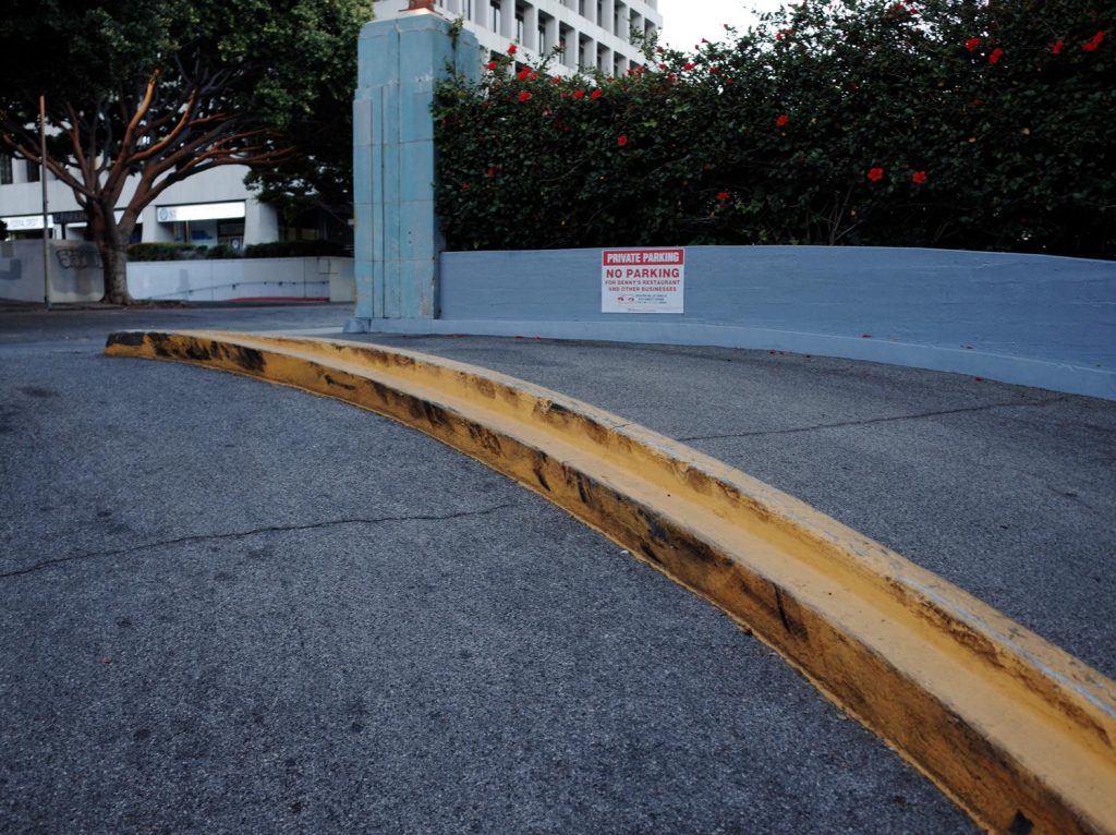
This will do a good job picking up the reds. Red is actually quite a dominant color in this image, the red floors, the private parking sign, the curb on the other side of the street by the tree. However, this took unbearably long, I left it running for like two minutes just to see an output and I never got it.
The first improvement that I thought to make was that instead of for each pixel looping through the json object that contains 64 different colors, each with 3 color values, was to use a k-d tree .
We're working in 3 dimensions (three color values) and attempting to calculate distance, so this is an appropriate data structure to place our items in. This solution becomes simple:
def build_color_tree(rgb_colors):
    color_points = [(color['r'], color['g'], color['b']) for color in rgb_colors]
    color_tree = KDTree(color_points)
    return color_tree

def find_nearest_color(r, g, b, rgb_colors, color_tree):
    dist, idx = color_tree.query([r, g, b])
    return rgb_colors[idx]
So we build the color tree and specify the axes and plot the points. Then we use the query function which returns the closest neighbor. Since we included the index as metadata for each point, we can get that index and feed it right back into the original object to get the closest color. However this is still slow as hell – we're checking each pixel in images that are around ~1mb each, this takes my 2021 Macbook Pro with 16gb of memory around 90 seconds for each image.
So I changed my approach – I kept the approach of using the k-d tree but now I decided to use k-means clustering in order to find 5 clusters for each image to convert each image into voronoi cells. This will also make it easy to calculate the value by creating polygons whose areas are simple to calculate. Then, for each cluster, I get the rgb value of the cluster center via:
    with Image.open(image_path) as img:
        img = img.convert("RGB")

        # np is numpy
        img_np = np.array(img)

        pixels = img_np.reshape((-1, 3))

        # apply k means
        kmeans = KMeans(n_clusters=num_clusters)
        kmeans.fit(pixels)
        cluster_centers = kmeans.cluster_centers_
Here is a comparison of these two methods:
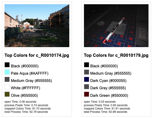
Nice! Now it takes ~3.5 seconds per image (with a sample size of 2 images.) Let's see what happens when we use more complicated images:
Interesting! So a quick rundown on what makes these images "complicated":
- left: Contains a weird pattern and only a few colors.
- center: Contains a lot of changing colors and each color takes up a very small surface area. However there are three larger blocks of "color" – red wire, red button, blue electrical reader, yellow electrical reader. Closeup of this below.
- right: Very few colors
Left and right with few colors performed great, although they did reveal a bug: It's possible to have multiple Voronoi cells that have the same color. I will modify the code to concat duplicates.
Center however, got real confused and missed some colors.


Original image turned into:
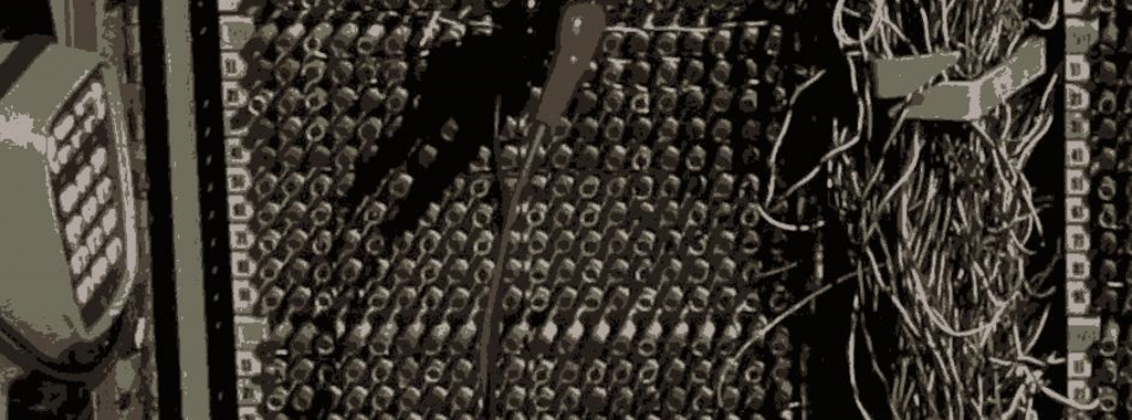
The point of this picture is all of the crazy little colors. What's happening here is that these colors, despite popping, take up such a small portion of the screen compared to the dominant greys and blacks elsewhere in the image and they get clobbered. Not gonna fix this right now because this is such an edge case but is kinda sad it would be cool if this came up when you sort by yellow since the yellow pops so hard. But to make that happen, I would need to prioritize finding saturated or contrasting colors over dominant colors.
I just spent like an hour fucking around with this and I got to the point where it was taking 40 seconds to generate an image and it was getting some of the colors to pop but still not perfect… I want to start developing the frontend so I'm just gonna leave it like this for now.
I added the models RgbColor and ImageColor to my express API, created a route getImagesByColorName, which the /image-color/{{color}} route queries by page.
I am pulling these values into my graphql server on build via gatsby-node . This is what I use to build the graphs so that I'm not making users request large json payloads which could slow down the server – instead for the graphs.
I ran the python script I wrote to go through all of the existing images and run analysis on the images and add the colors – this added 12,180 rows.
I created the /image-color route on the frontend which contains all of the different colors and links to the individual color pages. I've been playing around with the design of the different colors, putting colors in different places and all of a sudden, I realized that I have duplicate rows in rgb_colors. Disaster! The script to do color analysis on 3000 images took about 3 hours to finish last night (3000 * 3.5) / (60[minutes] * 60[seconds]) = ~3 but I was saving the data based on the assumption that there are duplicate values for different color names ie. "golden" and "orange" were both #ff5500. What a disaster!
I created backups of the dbs CREATE TABLE rgb_colors_old like rgb_colors; INSERT INTO rgb_colors_old (SELECT * FROM rgb_colors) DELETE FROM rgb_colors, ran the new insert statement, double triple quadruple checked there were no duplicates and ran the new script. At least I caught this now before I launched this – although it's frustrating.
I took a break and started working again once the colors with the new references to accurate rgb_colors had all loaded into the db.
At this point things were pretty easy – I just queried all of the results based on color and included the associated child images for each ImageColor, and loaded them into a chart graph the same way I had for my mood.
Unfortunately because of the presence of 0 values which are common for images on any given day, and the large x axis, my hope that the graph would something more like this:


And less like this:


In order to make something that is more readable. The first thing I did was to change the x-axis to be my month instead of day. That gave me this:


Much better but still unreadable. Looks cool though, but I just need to get rid of the long swoopy lines. The reason those swoopy lines come up is because some colors don't appear in my images very often – so if they come up once every couple months then the angles of each line is very different and you get a mess as seen above.
The solution to this is simple – include a value for each month, even if that value is 0. Padding the months that don't exist in the data with 0s generates this:


Which is exactly what I had envisioned when I set out to build this tool! This allows me to see all the colors that are present in the images I've uploaded over time.
One thing that I'll have to go back and modify though – this is probably doing something very close to assigning similar colors to each image. With slight variations it seems like there is something quite close to an equal percentage of colors for images across time.
A counterargument for that would be that over time the types of images that I take, especially when normalized by month, are quite similar. But I don't think this is true – especially when we consider that for the first year of uploading images, I uploaded a lot of screen captured images. This should change the frequency of image colors.
This also tracks with the image I had discussed before:
This image became quite grayscale despite there being a lot of different colors. Maybe I can stand to have a longer "build" time for grabbing these image colors, and maybe I can even do some sort of asynchronous analysis instead to speed it up.
Going forward I can use this tool to develop insight in different ways. Maybe I can make graphs on the colors base on shorter time frames like week, month or year. I can plot this against my mood and see if there are any strong correlations.
Check out the feature here!